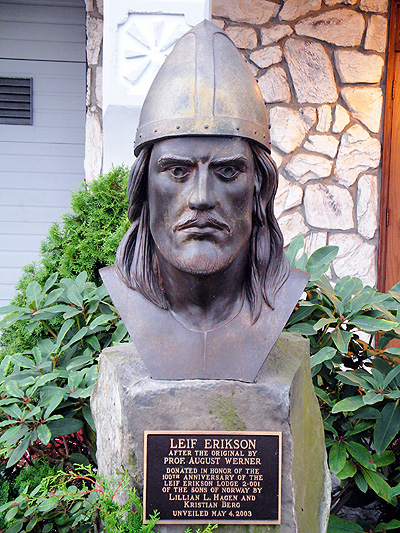
If you look at just about every image of Leif Erickson, you won't see horns on his helmet you will either see him with wings (on the helmet), a sword, or a cross. My ideal version of the Norseman logo wouldn't look all that different from the one you see now, but it would be lacking the braids, the moustache, and the horns. Honestly, I really like this statue of Leif Erickson. The only problem is it doesn't have the side view and color I want.
This is what the Norseman should look like:
I also really like Baltimore's Crest logo

Both look very dignified and professional. Now I know some people on here I'm sure believe that the logo shouldn't be changed because they believe it would bring bad luck to the team, but how could it? We've already lost 4 Super Bowls and something like 7 Championship appearances. Honestly, I believe this could change our fortunes as an organization! Now a new stadium, not a new practice facility but a new logo. If anyone is good at graphic design, please post what alternative logos you would like to see. Give me your honest opinion and we can set up a vote!
Here are some alternate logos that were made up a few years back. I'm not a Snoop music fan, but I like some of the logos.
https://www.youtube.com/watch?v=Sq7rHfzVnBg