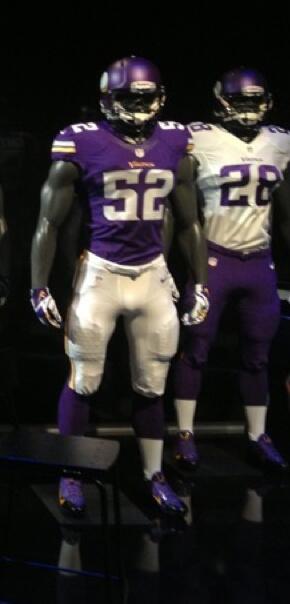
NextQuestion wrote:CONFIRMED LEAK from UNI WATCH!!!
If this truly is the "new" uniforms, it's pretty boring. It is as if Nike didn't even bother thinking about the Vikings, they just wanted to move on to the next team as soon as possible.
petev_sj wrote:
If this truly is the "new" uniforms, it's pretty boring. It is as if Nike didn't even bother thinking about the Vikings, they just wanted to move on to the next team as soon as possible.
I almost have to agree with this. People have been talking about this "new uniform" thing for weeks now--as if it was the coolest thing ever. lol. Y'all built it up like it was going to be "oh-so-amazing." I just don't see it. They are alright I suppose, but kind of disappointing. I'm hoping they look better in "real life." And what's with no one being able to keep a secret?!?! And here I thought women were bad. lol. So much for this big "unveiling at the Draft Party." Fail. I was kind of looking forward to that little perk. Blah.
If this truly is the "new" uniforms, it's pretty boring. It is as if Nike didn't even bother thinking about the Vikings, they just wanted to move on to the next team as soon as possible.
Boring? Not at all. It's just not busy like the 06-12 era ones. I like how classic these are looking.
dead_poet wrote:
I was hoping that was just just the way the uniform was bunched. Lame. But it's small enough that it's not too noticeable.
It _is_ lame. Why change the font that's been used for 60 years, of all things?
Overall, though, it works for me. It certainly could have been a lot worse. It's ten times better than the current uniform, but it could have gone further toward tradition. And I do like the white over purple for the road uniforms.
petev_sj wrote:
If this truly is the "new" uniforms, it's pretty boring. It is as if Nike didn't even bother thinking about the Vikings, they just wanted to move on to the next team as soon as possible.
On the contrary, it looks like they did the smart thing and kept it clean and simple instead of creating an overworked monstrosity like the Oregon uniforms or slapping the Vikes with a tacky neon accent like they did with the Seahawks. Overall, I like it, although I'm waiting for a 360 degree view to see how the sides and back look (especially the side of the helmet).