Re: New Uniforms?
Posted: Mon Apr 22, 2013 9:03 am
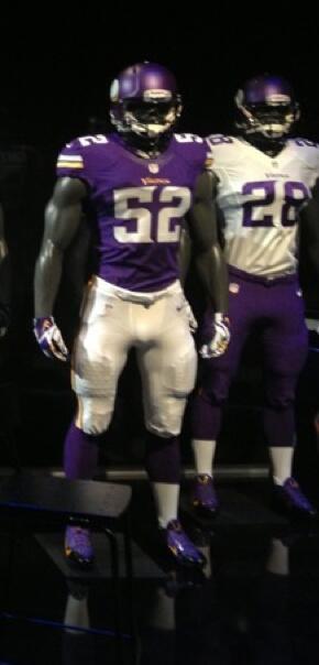
Triangle? Don't tell me...Mothman wrote:
I think we're going to get them. I hope so. I hate that horn shape on the pants.

I have a feeling it's AD who did it....
A message board dedicated to the discussion of Minnesota Viking Football.
https://vikingsmessageboard.com/
Triangle? Don't tell me...Mothman wrote:
I think we're going to get them. I hope so. I hate that horn shape on the pants.
More:Purple Domination wrote:The rolls of quarters are the "Nike Pro Combat" padding. I think some players have worn them in the past couple of years. I know AD has advertised them. http://store.nike.com/us/en_us/?l=shop, ... 91212_GPLA
http://news.yahoo.com/nfl-passes-pad-ru ... --nfl.htmlThe NFL made thigh and knee pads mandatory equipment for the 2013 season, something the players' union was not pleased with.
It's this kind of thinking that resulted in the current uniforms we have today (the ones that nobody likes). Slick and modern with all kinds of patterns, textures, and curvilinear lines isn't necessarily better. Classic with slightly modernized details is the way to go and thankfully looks like what they're doing. Can't wait to see 'em.indianation65 wrote:I'll be okay with a radically different uniform. Classic approaches often times bring about similar results. A more realistic horn, the blond viking, 3D, pellets or chains illusions, I don't care. I want the Vikings to come out of a tunnel with zest, fervor and gasp, Flash! Change the pants, put some horns, put a sword or spear across the legs starting on the rear, I'm game!
Modern or classic, the key is to keep it simple and clean. Overworked design is design that doesn't work.HornedMessiah wrote: It's this kind of thinking that resulted in the current uniforms we have today (the ones that nobody likes). Slick and modern with all kinds of patterns, textures, and curvilinear lines isn't necessarily better. Classic with slightly modernized details is the way to go and thankfully looks like what they're doing. Can't wait to see 'em.
K.I.S.S.Mothman wrote:the key is to keep it simple and clean. Overworked design is design that doesn't work.
You know, that helmet thing, Packers never had a logo on their helmet until Lombardi showed up.......indianation65 wrote:What, "Nobody Likes"? The Broncos and Patriots years ago both changed their helmet logos completely, along with the uniforms and good things happened. To say that nobody would like a new look, and "everyone" likes it classic is not accurate. Maybe in the Vikes forum most who comment will uphold the classic look, but not everyone. Regardless of what changes will or will not be made this coming season, I will always cheer for those in purple, and snow and cold late in the season wouldn't hurt either...from now on! I guess that's asking too much, and I know, different topic.
...wisdom through opinion
Two of my favorite all-time combos. Them helmets were awesome.NextQuestion wrote:I loved Tampa Bay's creamsicle uniforms. Patriot throwbacks that they use are also fantastic as well.