Page 1 of 1
Concept NFL Logos
Posted: Wed Jul 22, 2015 9:22 pm
by DK Sweets
22 logos for 22 players
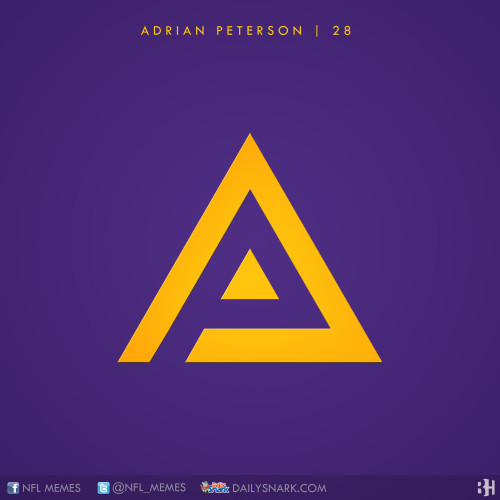
"Adrian Peterson is still arguably the best running back in the league, and one of the all time greats. The sharp logo embodies his sharp cutting downfield style. The ‘A”s negative space forms the ‘P’ of his last name."
Obviously more at the link.
Re: Concept NFL Logos
Posted: Thu Jul 23, 2015 6:14 pm
by S197
Fixed your link, if you don't add the "http://" part it shows as broken.
Anyway, many are similar. I think the "AP" should be an "AD" but most non-Viking fans wouldn't know that. The Revis one is pretty bad. Megatron's is almost good but the blue doesn't seem to line up perfect with the logo.
Re: Concept NFL Logos
Posted: Thu Jul 23, 2015 7:06 pm
by DK Sweets
S197 wrote:Fixed your link, if you don't add the "http://" part it shows as broken.
Anyway, many are similar. I think the "AP" should be an "AD" but most non-Viking fans wouldn't know that. The Revis one is pretty bad. Megatron's is almost good but the blue doesn't seem to line up perfect with the logo.
Thank you for letting me know that. I copied and pasted the link from my mobile browser and tested it after I posted in Tapatalk, but I was wondering if it would work for people on computers.
Re: Concept NFL Logos
Posted: Fri Jul 24, 2015 4:57 pm
by Jordysghost
S197 wrote:Fixed your link, if you don't add the "http://" part it shows as broken.
Anyway, many are similar. I think the "AP" should be an "AD" but most non-Viking fans wouldn't know that. The Revis one is pretty bad. Megatron's is almost good but the blue doesn't seem to line up perfect with the logo.
I think there are plenty non Vikings fans that understand the whole "All Day" think, but I guess its just commonplace to call a player by his initials, im guilty of this myself alot.